When I was a small boy I was once allowed to sit up late and watch a television programme about space. As the BBC's astronomer-for-life Patrick Moore, who by the early eighties was beginning to resemble a chunk of unlovely moon rock, showed viewers a recent satellite photograph of the earth's western hemisphere, I objected loudly. Why, I asked my parents, were the green and brown expanses of the Americas devoid of lines? Where was the long thin line that divided the United States from Mexico? Why was the isthmus between North and South America not covered in the jagged half-circles that marked out the pathetically small realms of fractious republics like Nicaragua and Honduras?
My parents were amused. Interpreting my confusion as a sign of tiredness, they sent me to bed before I could upset by a satellite's snapshot of the eastern hemisphere. I may be mistaken, but I believe that my mother said something like "You'll understand when you're older, dear", as she tugged me down the hallway towards my bed.
Thirty years later, I am still sometimes startled when I see a shot of earth from space. I'm so used to looking at maps and atlases which show the world's political boundaries - the borders between nations, but also the lines of demarcation between states, counties, districts, cantons, and cities - that I find it difficult to remember that they aren't, in the objective eye of Mother Nature, or the universe, or an approaching fleet of spacecraft filled with aliens uninterested in the intricacies of human history and sociology - real.
My parents might try to deny it, but they are partly responsible for my cartophilia. When I was too young to remember it, they pinned an enormous map of the world on the bedroom I shared with my brother. As I lay in bed before falling asleep or rising, I stared, fascinated, at the shapes of the world's continents, the tangle of its political boundaries, and the fissures made by its great rivers. Accustomed to reports of famine in Africa on the television news, I came to see the continent as an enormous skull, with its cranium bulging into the Atlantic and its mandible extending south. As the Cold War got colder in the early and middle eighties, and movies like
Red Dawn and
Rocky IV turned the prospect of a Hot War into the stuff of schoolboy fantasy, I became fascinated by that long and cryptic name The Union of Soviet Socialist Republics, which marched east across the wastes of Siberia towards the Bering Strait, where Alaska seemed to wait like an enormous fist.
The map on my wall was based on the Mercator model of world cartography, which was devised by European imperialists in the sixteenth century and made the northern hemisphere dominate the south spatially as well as politically. The equator sits two-thirds rather than half of the way down the Mercator map. As a result, puny Europe tends to loom as large as South America, and Greenland is bigger than Africa, even though it covers less than a third of the area of that continent.

The regular changes which wars and revolutions give to the world's lines of demarcation mean that a political map is relatively easy to date. I suspect that the map on my bedroom wall was produced in the late seventies or early eighties, because I recall it showing, near the point where Africa tapered off into the Indian Ocean, the names Angola and Mozambique, two nations which crawled from the wreckage of the Portugese empire in 1975. But Angola was still bordered by South West Africa, the name of the colony that Germany established in the nineteenth century and South Africa seized after World War One. South West Africa would not become the independent nation of Namibia until late in the eighties.
It is easy to appreciate the contingent, political nature of maps which show national boundaries, but harder to grasp that even the most scrupulously detailed map of the world's non-human features is incapable of anything approaching objectivity. In the
poem which, seven or so years ago, supplied this blog with its name, the great cartographer of regional New Zealand
Kendrick Smithyman explained the limitations of his art:
Look for an unformed road
lifting suddenly, steep. But get over the crest,
you’re on top of packed sand.
Carry on to the Head. You cross
the old tramway which used to go up to
the Harbour, remains of the one time main road
to gumfields (south of the river and this next
river) out from the edge of the Forest. It went on
down the coast, then climbed inland on the line
Of a Maori trail. Of course, the map doesn’t
say anything about that. Maps can
tell you about what is supposedly present.
They know little about what’s past and only
so much about outcomes. They work within
tacit limits. They’re not good at predicting.
If everything is anywhere in flux
Perhaps we may not read the same map twice.
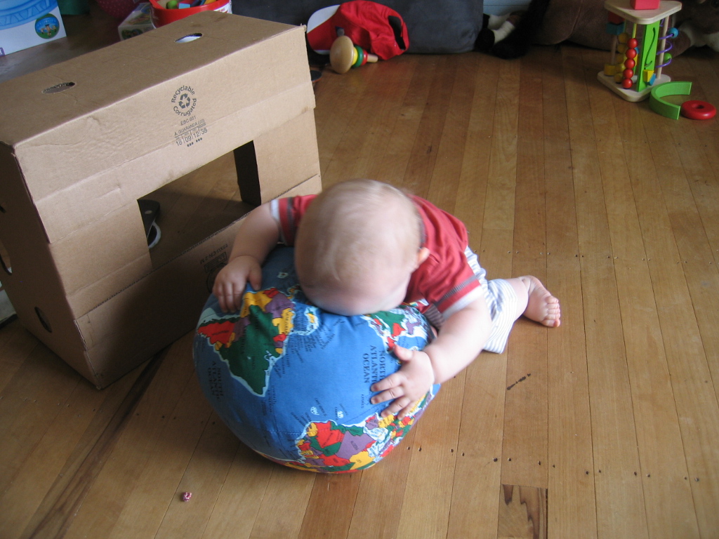
Aneirin's Uncle and Aunty gave him a map of the world for his first Christmas. Where my first map was flat, Aneirin's is large and round and soft, like the brain of an elephant. It divides the world into nations, and America into states. (After examining Aneirin's world, my father complained about the way that it breaks America, but not similarly large nations like China or Brazil, into its constituent parts. He accused the cartographers involved in the production of the toy of Amerophilia, or Sinophobia, or both, and he may have had a point, but I have always thought that the United States looks better when its internal borders are shown. With its grid of states shaped like squares and rectangles and filled in with strong primary colours, America looks a little like a Mondrian canvas, or an aerial photograph of a Midwest farm sown with different crops.)
The political boundaries on Aneirin's globe are up-to-date, and yet not necessarily unassailable. His version of Europe includes Kosovo, which has been widely recognised as independent since 2008, and his Africa distinguishes South Sudan from Sudan, in recognition of the 2011 referendum where 99% of the people of the south voted to secede from their northern oppressors.
But the nations on Aneirin's globe do not include Somaliland, the former northern region of Somalia which has run its own affairs since the collapse of that state twenty years ago, and has won plaudits from Africa-watchers like Bob Geldof for its democratic elections and relatively peaceful streets. Somaliland has for years now been pleading in vain for recognition as an independent state, but its calls have been opposed by its larger and more powerful neighbour Ethiopia, which is one the United States' most important allies in Africa.
The Republic of Abkhazia, which broke away from Georgia in the late nineties and is recognised by six nations, including Russia and Venezuela, is also absent from Aneirin's globe. Georgia, which is a close ally of the West, still claims Abkhazia, and has talked of regaining the region by force.

Aneirin's globe plants a P on the West Bank to signify Palestine. Is this rather drastic abbreviation a concession to the controversy around the status of Palestine, which has been occupied and colonised by Israel since (at least) 1967, yet was recently recognised by most of the world as an independent nation, or is it simply a necessity, given the tiny size of the West Bank? The mapmakers have given up altogether on naming the tiny European countries of Liechenstein, Monaco, and Vatican City, though they have been able, thanks to the generous blue spaces of the Pacific Ocean, to recognise nations like Nauru, which covers twenty-one square kilometres, and Tuvalu, which is only five kilometres larger.
With their attempts to sum up a complex and contested reality with a few shapes and symbols, maps are a metaphor for the limits of all human attempts to know the world. They are both essential and inherently flawed. They should be seen as an invitation to discussion and redefinition, rather than as final definitions. That, at any rate, is what I think I overheard Aneirin saying to himself when he was playing with his present on Christmas day...
[Posted by Scott Hamilton]


16 Comments:
http://sciencenordic.com/vikings-grew-barley-greenland
Greenlanders grew barley in the middle ages!
I think Africa is the most obviously shaped continent on Earth. It's shaped like a gigantic skull that is mortally wounded, with a huge horn on its forehead.
It's mostly devoid of life, and thus a great illustration of death or destruction.
Why did our heavenly Father make it look like this? I think it would help if we went to our Father's word, and looked firstly at the skull in the book of Matthew, chapter 27:
31 And after that they had mocked Him, they took the robe off from Him, and put His own raiment on Him, and led Him away to crucify Him. 32 And as they came out, they found a man of Cyrene, Simon by name: him they compelled to bear His cross. 33 And when they were come unto a place called Golgotha, that is to say, a place of a skull, 34 They gave Him vinegar to drink mingled with gall: and when He had tasted thereof, He would not drink.
The next question we need to ask is, "Why does the African skull have a horn on his forehead?" I believe Africa has a horn because horns are symbolic of power. There's a good example of this in Zechariah 1:
18 Then lifted I up mine eyes, and saw, and behold four horns. 19 And I said unto the angel that talked with me, "What be these?" And he answered me, "These are the horns which have scattered Judah, Israel, and Jerusalem." 20 And the LORD showed me four carpenters. 21 Then said I, "What come these to do?" And he spake, saying, "These are the horns which have scattered Judah, so that no man did lift up his head: but these are come to fray them, to cast out the horns of the Gentiles, which lifted up their horn over the land of Judah to scatter it."
It's very interesting that this horn has long been known as the Horn of Africa because it looks like a horn.
For more info on why the world looks like it is see
http://www.godsgeography.com/
"Patrick Moore" Shurely?
Thanks for that correction, anon!
My geography was always hopeless. Maps fascinated but I was also interested in Astronomy and had a book by Moore and so on.
I have great trouble keeping a clear image of places. Czechoslovaki drifts aroudn Europe and The Phillipines flost around the Pacific. There's no way I can work out where
I've never seen Africa as a skull. Spain looks like a head. Italy a boot.
Ireland is a little teddy bear. Greece is the genitalia of Europe. England is of course the brain with some dross flung around about it.
The Mercator projection is only one as it is virtually impossible to represent a spherical (shape, space) on a flat surface. The USSR and Greenland I knew were less large than they looked. I've always wanted to own a globe though.
Even that globe doesn't look like space as space is in fact space-time and is curved or "shaped", as lumpy as Aneirin's globe and perhaps even more difficult to understand if we could "see" it.
With a globe one can play God! Is Anerin already dreaming of world conquests?
Hi Richard,
I remember being impressed by the consistency between the horizontal rectangular shape of Czechoslovakia and the country's long name, which seemed to fit snugly inside the rectangle. On a map Czechoslovakia looked a little like a speech bubble!
And I hadn't thought of Greece as the genitalia of Europe. I'm sure Ted Jenner would love the idea, though!
I keep seeing Tonga's northerly Vava'u archipelago as an octopus:
http://www.disasterscharter.org/image/journal/article.jpg?img_id=67875&t=1268058832696
Barrow is the place. About 2000 or so I started playing chess online and I arranged a 1 hour game with a chap in Barrow, Alaska.
I mentioned this to a friend, and he had heard of it, it is the northern most place in or on the Americas. One travel writer claimed it was one of the most boring places. Was it Thoreux (or however his name is spelled).
In the 60s my grandfather came back from a return to England with a complete set of maps, each covering each county. It was fascinating. I have one of those big maps here although I don't think it is part of what he had...
Smithyman would have had similar for NZ for sure.
I used to like tracing maps, it seemed like a kind of magic.
Yes, Czechoslovakia is a strange place, it juts into Germany...I keep forgetting it is up there and for some reason I think it is much further south near or beneath Austria. Yes, like a speech bubble.
I remember seeing the first images of the dark side of the moon. Astronomy was a fairly big interest for me in those days.
As to maps I also have a facsimile, framed, of Cook's first map of NZ. Any mapologists? I sold a picture of Elvis for $100 on TM so I wonder what the old NZ Map is worth. I suppose the enthusiasts and experts will laugh...
http://www.tumblr.com/tagged/mercator%20projection
http://articles.timesofindia.indiatimes.com/2005-05-27/edit-page/27845927_1_map-india-countries
India discriminated against by Mercator
http://www.blogger.com/comment.g?blogID=7843316&postID=2545791511792576900
This is the first time i read your blog and admire that you have posted on this...I really found useful.Keep updated.
world map canvas
Nice! thank you so much! Thank you for sharing. Your blog posts are more interesting and informative. flat earth map
what a great post... i always come for read your post because of your content. keep posting
Just a smiling visitor here to share the love (:, btw outstanding layout.
Post a Comment
<< Home